Wednesday, 23 April 2014
Evaluation Question 4
Please hover your mouse below for the link to show up, alternatively the link to my evaluation website can be found above the label list.
http://rubyrhodeswgsbmedi.wix.com/rubyrhodesmedia#!evaluation-question-4/c1pwr
http://rubyrhodeswgsbmedi.wix.com/rubyrhodesmedia#!evaluation-question-4/c1pwr
Evaluation Question 3
Please hover your mouse below for the link to show up, alternatively the link to my evaluation website can be found above the label list.
http://rubyrhodeswgsbmedi.wix.com/rubyrhodesmedia#!gallery/cff9
http://rubyrhodeswgsbmedi.wix.com/rubyrhodesmedia#!gallery/cff9
Evaluation Question 2
Please hover your mouse below for the link to show up, alternatively the link to my evaluation website can be found above the label list.
http://rubyrhodeswgsbmedi.wix.com/rubyrhodesmedia#!info/c161y
http://rubyrhodeswgsbmedi.wix.com/rubyrhodesmedia#!info/c161y
Evaluation Question 1
Please hover your mouse below for the link to show up, alternatively the link to my evaluation website can be found above the label list.
http://rubyrhodeswgsbmedi.wix.com/rubyrhodesmedia
http://rubyrhodeswgsbmedi.wix.com/rubyrhodesmedia
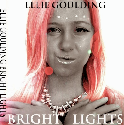
Digipak Audience Feedback
+ like the use of different hair colours on each panel
+ the font on the cover reminds me of a church which links the video to the digipak
+ inside photo is effective
+ love the layout of the back panel
+ cover is simple yet effective
+ clever idea of using glitter on the CD to coincide with a bright light
+ kept to a colour scheme
+ copyright text sounds realistic
+ like the use of numbering the songs
+ photos are high quality
+ love the jewels used on the models face
+ like her nails not being painted as otherwise it would've been too much
- don't like the photo on the CD
- the spine is missing the code linking to the record company
- don't like the editing on the back panel on the green haired image
- the writing on the spine should have more spacing between the artist and album title
- cover is too plain and boring
- fake eyelashes are not stuck on properly, the inside photo clearly shows this
- on the CD the title of the album is written larger than the artists name, it should be the opposite way round
Magazine Advert Feedback
+ photo is dominant
+ attention is drawn to the artists name
+ good choice to have 'Ellie Goulding' written in black
+ love the idea of the QR code, goes with modern technologies
+ like the lens flare effect
+ white background looks good
+ lens flare gives the effect of lights
- the album title is hidden
- the iTunes image should be placed more in the corner
- 'download here' could be written on one line


Conventions of digipaks & magazines
Digipak:
Cover = main image could either be a photograph or an illustrated image- in the pop genre particularly with females the main image is usually a picture of the artist
- the artists name is included so that the album can be remembered and associated with the artist
- the album name is included, within the female pop genre it is usually written in a girly bubbly font
- the album name can give an insight to what the songs on the album will be about
Inside = matching colour scheme to rest of digipak
- few or no text
Back = list of song titles usually centred
- barcode in the bottom right hand corner
- record company
- copyright and year
- who owns the copyrighted material
- who the album has been distributed by
Spine = name of band and album in the same simplistic fonts
- code linking to the record company
Magazine:
- main image should follow the same theme of the album cover- should follow the colour scheme of the digipak
- the largest piece of text on the page should be the name of the artist and the second largest piece of text should be the album title
- 'new album' usually features
- 'includes' list where most popular tracks on the album are featured along with any other bonus features
- artists website
- possibly social network accounts i.e. Twitter
- name of record label
- where you can buy and download the album
- sometimes tour information
Subscribe to:
Comments (Atom)