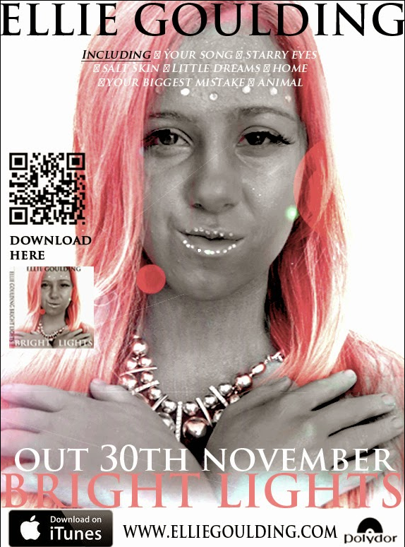
+ photo is dominant
+ attention is drawn to the artists name
+ good choice to have 'Ellie Goulding' written in black
+ love the idea of the QR code, goes with modern technologies
+ like the lens flare effect
+ white background looks good
+ lens flare gives the effect of lights
- the album title is hidden
- the iTunes image should be placed more in the corner
- 'download here' could be written on one line
Wednesday, 23 April 2014


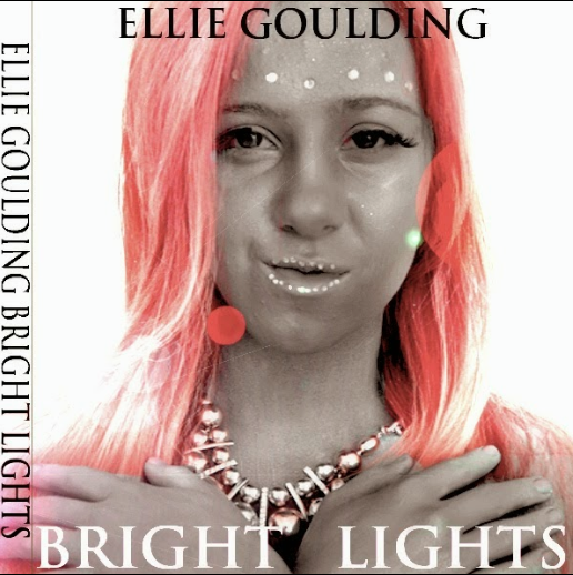


Conventions of digipaks & magazines
Digipak:
Cover = main image could either be a photograph or an illustrated image- in the pop genre particularly with females the main image is usually a picture of the artist
- the artists name is included so that the album can be remembered and associated with the artist
- the album name is included, within the female pop genre it is usually written in a girly bubbly font
- the album name can give an insight to what the songs on the album will be about
Inside = matching colour scheme to rest of digipak
- few or no text
Back = list of song titles usually centred
- barcode in the bottom right hand corner
- record company
- copyright and year
- who owns the copyrighted material
- who the album has been distributed by
Spine = name of band and album in the same simplistic fonts
- code linking to the record company
Magazine:
- main image should follow the same theme of the album cover- should follow the colour scheme of the digipak
- the largest piece of text on the page should be the name of the artist and the second largest piece of text should be the album title
- 'new album' usually features
- 'includes' list where most popular tracks on the album are featured along with any other bonus features
- artists website
- possibly social network accounts i.e. Twitter
- name of record label
- where you can buy and download the album
- sometimes tour information
Wednesday, 26 March 2014
Ancillary Original to Edited Photos
Digipak:
Front Cover -


Inside Cover -


CD -


Back Cover -


Magazine:
Advert -

Final Cut Audience Feedback
As we did for our rough cut, we showcased our final cut on the projector in front of our media class in order to get feedback from people who had been through the same process as us.
We were eager to show people what we had done as we had worked really hard since the rough cut as we had filmed the whole performance again.
Here are some photos of the class watching our music video:


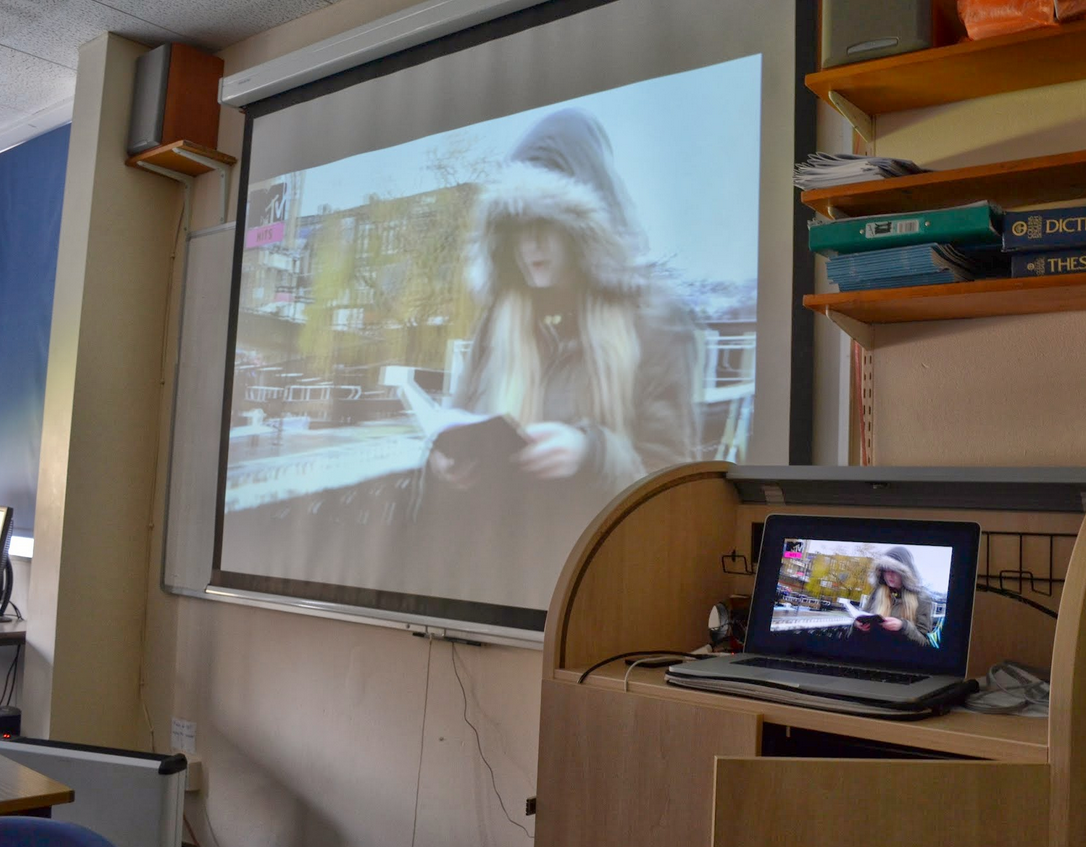
Just like before they were asked to write feedback hopefully including more positives than negatives!
Here is a summary of the points made:
+ a lot better than the rough cut
+titles at the start look professional
+ candle shot was effective
+ makeup was good
+ well edited, editing suits the pace of the editing
+ shots of piano/church really good
+ lighting of church shots are good
+ good locations
+ good use of mise-en-scene
+ good angles
+ first stained glass shot is fantastic
+ high quality shots
+ good selection of shots for a slow song
- zooms are too long and off putting
- shots of the model walking towards camera should be shorter
- model cannot play the keyboard/ doesn't look like she's playing
- lip sync is out in some parts
- second stained glass window shot is not needed and was not in focus
- too many scenes with the book
- too much panning
Wednesday, 19 March 2014


Subscribe to:
Posts (Atom)